 2017 Sapporo
 2017 Sapporo
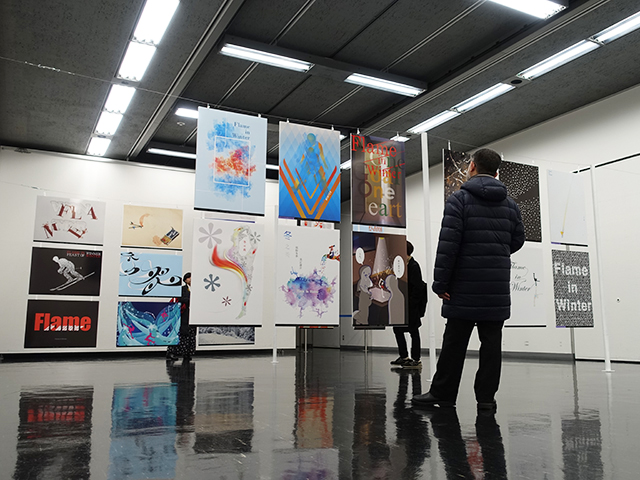 2017 Sapporo
 2017 Sapporo
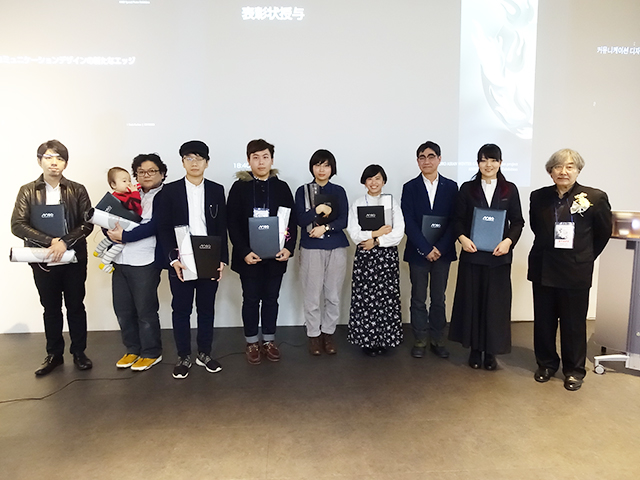 2017 Sapporo
SCHEDULE of ANBD Special Poster Exhibition
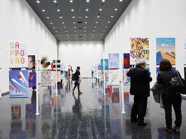
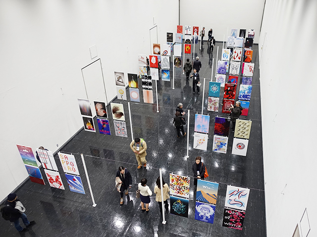
ANBD Special Poster Exhibition
- 2017.02.08 - 12
- Sapporo Citizens Gallery
THEME of ANBD Special Poster Exhibition
-
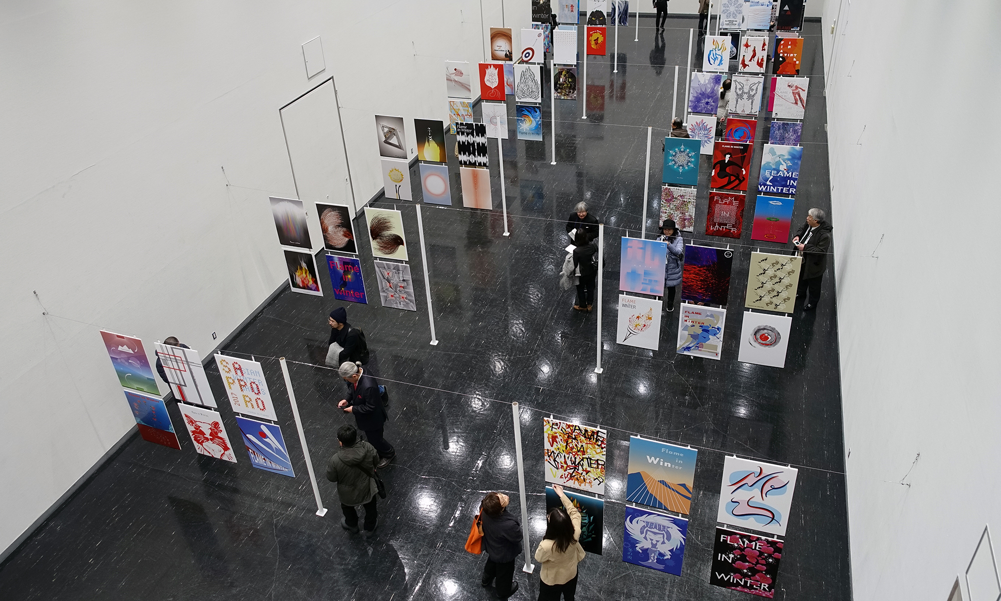
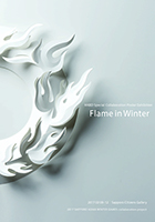
Flame in Winter
PARTICIPANTS of ANBD Special Poster Exhibition
Poster Exhibitor: 217
Exhibitor of a solo exhibition: 16
Reviewer: 16
Executive committee member: 27
Part-time student: 22
Exhibition guest: 350
AWARD of ANBD Special Poster Exhibition
ANBD Judging Committee awards the excellent artworks that adjust to the theme and express excellently a prize.
* All rights reserved.
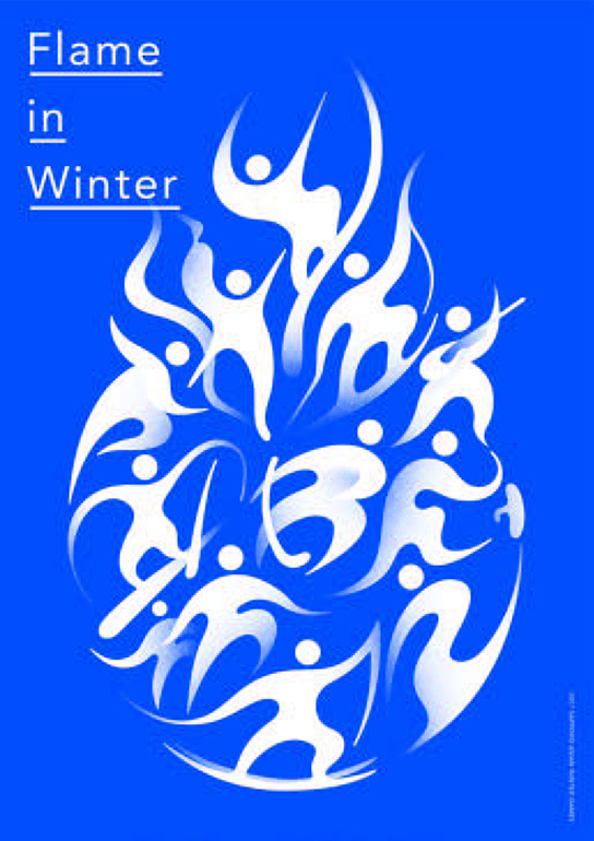
- GRAND PRIX
-
room-composite
- Harada Yurie
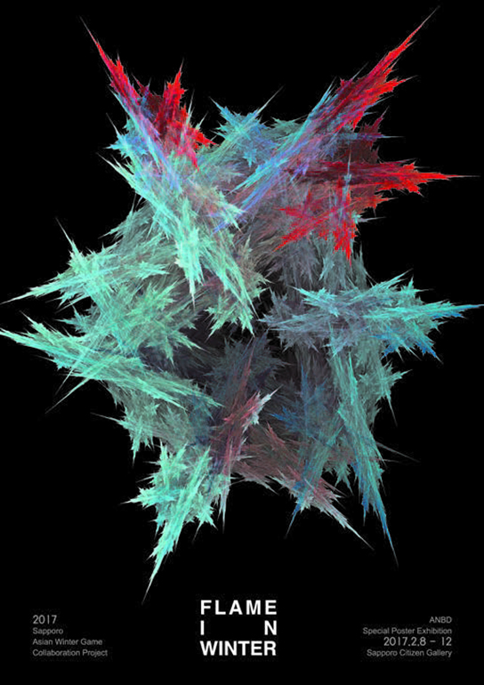
- GRAND PRIX
-
ChungBuk National
- Jeong Jihong
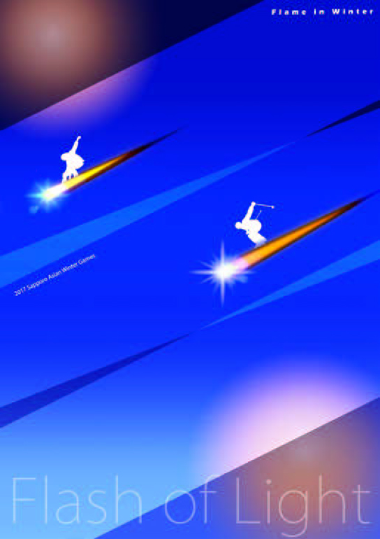
- SPECIAL AWARD
-
Flash of light
- Chih Chiawang

- SPECIAL AWARD
-
In the line
- Kasai Noriyuki

- SPECIAL AWARD
-
Snowman
- Kawamura Sakurako
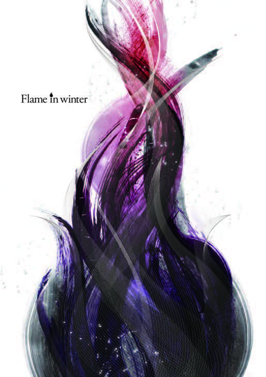
- SPECIAL AWARD
-
Split
- Komatsu Futoshi
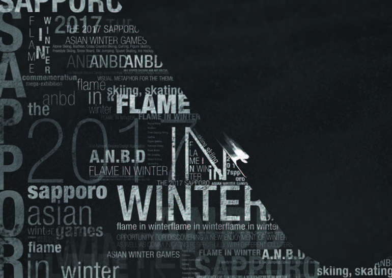
- SPECIAL AWARD
-
Flame in ski
- An Seyeon
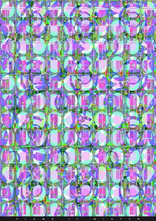
- EXCELLENT AWARD
-
Flame in winter
- Chun Jaehyun
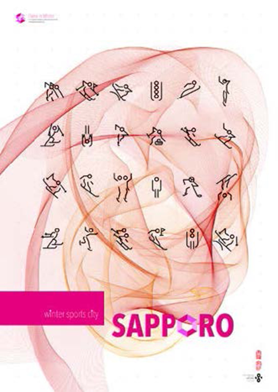
- EXCELLENT AWARD
-
Flame in winter
- Chung Min

- EXCELLENT AWARD
-
Fiery heart
- Guo Yunpeng
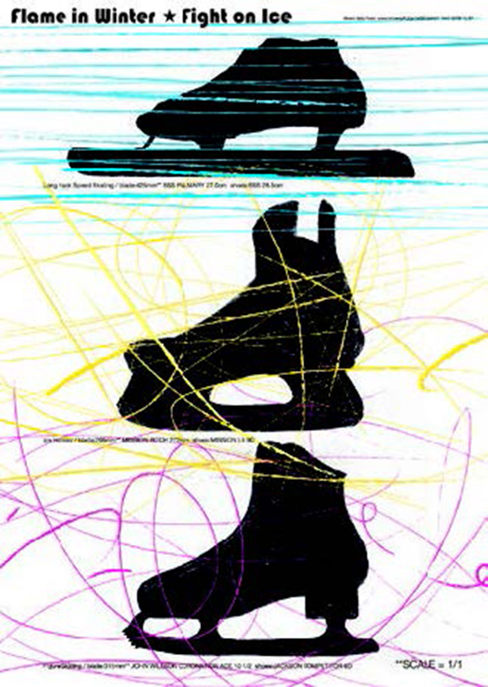
- EXCELLENT AWARD
-
Fight on ice
- Hayashi Mitsuo

- EXCELLENT AWARD
-
Flame in winter, flower in winter
- Liao Yuze
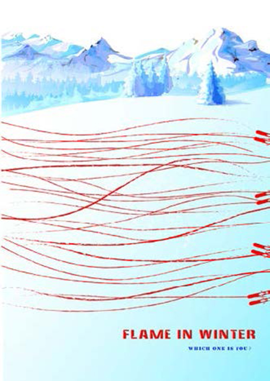
- EXCELLENT AWARD
-
Winter of passion
- Luo Shumin

- EXCELLENT AWARD
-
Cold but warm
- Maekawa Rina
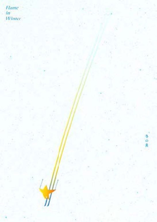
- EXCELLENT AWARD
-
Meteor
- Yuen Kamshing

- EXCELLENT AWARD
-
Flame, Flake, Frost
- Choi Junyeong
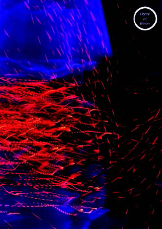
- EXCELLENT AWARD
-
Homogeny
- Fan Hsiwen

- EXCELLENT AWARD
-
Ame-in-winter-10-04-1981-a1
- Urbanczyk Marcin

- EXCELLENT AWARD
-
Rabbits player!!
- Kubokura Yui

- EXCELLENT AWARD
-
Look in
- Jeon Soyoung
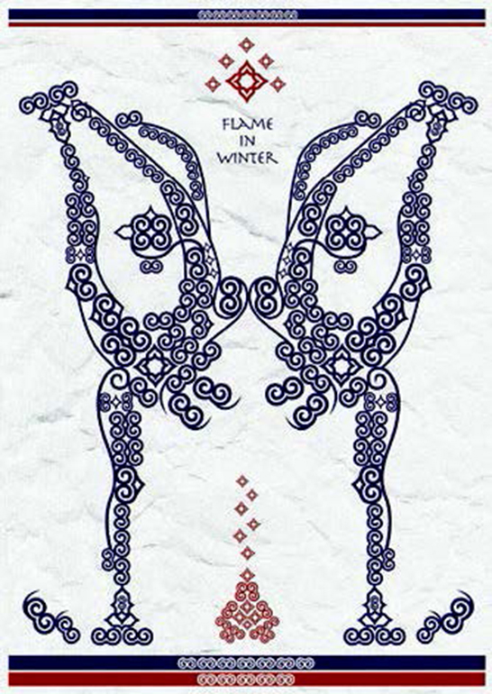
- EXCELLENT AWARD
-
The ice flowers
- Kasai Noriyuki

- EXCELLENT AWARD
-
Flame in winter / victory
- Lechwar Stefan
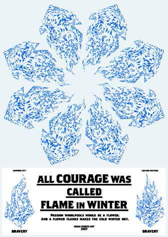
- EXCELLENT AWARD
-
Ice courage flower
- Nomura Sou

- EXCELLENT AWARD
-
Setu
- Oshikiri Aya

- EXCELLENT AWARD
-
Flare in winter
- Zhang Huiying

- EXCELLENT AWARD
-
Small movement
- Oh Jinhee
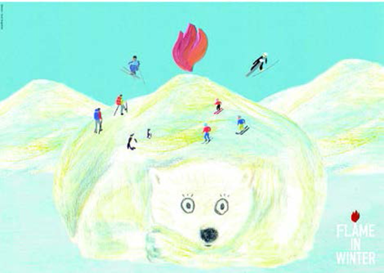
- EXCELLENT AWARD
-
Bears will wake up in winter
- Sugimoto Tsuki
ARTWORK PAMPLET of ANBD Special Poster Exhibition
KEYNOTE of ANBD Special Poster Exhibition
Boris Kochan
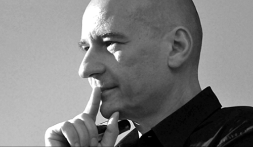
Boris Kochan (*1962) is a corporate designer and entrepreneur, maker of books and publisher, consultant and managing partner of the design and communications agency, KOCHAN & PARTNER as well as the president of Deutscher Designtag. Following his training in layout and typography, he gained professional experience in journalism at the German daily, Süddeutsche Zeitung, in the typesetting studio of Lothar Wolf and in the lithography department at Jürgen Höflich offset andscreen printing.
In 1981, Boris Kochan, together with friends, co-founded a studio for graphic design and text, adding the departments of setting and lithography just two years later. In 1989, ZELIG-DRUCK was added and in 1995, the interactive unit PEPPERMIND became part of the group.
With more than 60 employees, KOCHAN & PARTNER is one of the ten largest owner-managed agencies for branding and communication in Germany. Boris Kochan is chairman of the GRANSHAN competition for scripts and part of the jury of numerous competitions of typography and design such as Berliner Type. From 2007 to 2014, he was elected chairman of the Typographische Gesellschaft München, in June 2007 he was appointed to the German Committee of the Type Directors Club of New York and in 2011 he became a board member at iF Industrie Forum Design e.V. He is also Founder & Curator Editorial Design conference EDCH (formerly known as QVED).
The New Edge of Communication Design
ANBD's invitation, to speak at the opening of the poster exhibition of the Sapporo Asian Winter Games is a great honour.For this, I would like to express my deepest gratitude.Especially as this is my very first time in Japan and I am absolutely thrilled!
≫The New Edge of Communication Design≪ is as important a topic as it is difficult.Especially in a complex world, in which various cultures and societal developments, political interests, economic systems and an increasingly complex and often very short-lived media landscape converge.And where constellations change often and are equally short-lived.So when I speak of the role of design today, what its challenges and new developments are and how they might affect us on a global scale, I can only do so from my very subjective viewpoint.
My account will simply reflect a single moment in time. It is based on my personal experience with international and contemporary design and the modern economics of creativity. There are three different areas of my work that influence my life and design. And they constantly interact.As founder and CEO of Kochan & Partner, one of Germany's largest owner-operated agencies for branding and design, I am an entrepreneur.And this is the starting point of my activities:To keep my company on track in what is often a turbulent market of creativity.It is about meeting the challenges of every-day work as much as it is about the long-term economic challenges.It is also about meeting the challenges arising from technological and aesthetic developments while constantly reformulating one's own demands on design in the daily work.
My second field of work is this: As founder and organiser of the GRANSHAN Conference for non-Latin Typography I created a platform together with many colleagues.It offers room to discuss the often visionary ideas for global, intercultural communication with regards to the design of type fonts.And my third area of work is that as president of the German umbrella association for design, Deutscher Designtag (DT).As such, I try to create a connection between the economy of creativity and the world of politics.I do so not only on an economic level, but also on a cultural and political level.These three fields are like the triad of my work, and it is with a view to this triad that I would like to approach the topic of this lecture.
I will of course present a German perspective, especially, when it is about my business experience.And I would never dare tell you anything about Japanese design or the Japanese economics of creativity.You all know this much better than I.But there is something that unites us * the passion for design.Without this driving passion, none of us would be able to perform the way we perform.But when we talk about the notion of the new, I believe that we must turn to continuity if we are to find any answers * and passion is one such continuous presence, maybe even the most important one…
Just looking at this exhibition, I see so much passion * it would not have been possible to create such a success in regards to design, content and organisation, without it!The visual metaphor "flame in winter" used for the Sapporo Asian Winter Games reminded me of a famous quote by the composer Gustav Mahler.[Image Gustav Mahler and text with quote]It refers to passion, preservation and progress.“Tradition is not about the adoration of the ashes, it is about passing on the torch.”So if we are to talk about “The New Edge of Communication Design”, we must also talk about tradition.And about historical role models, and what would be more obvious than to start here and to travel back in time just a little.
Going back to 1972, when the XI Olympic winter games took place here in Sapporo.In the summer of the same year, the Games of the XX Olympiad were held in Munich, the city, in which I founded my company and where I live most of the time.For me, a boy of ten, these summer games were a real thrill.Such variety of colour and diversity never seen before and the feeling of awakening was almost palpable everywhere.It was not just about sport.It was the breathtaking architecture, an arts programme including artists from the whole world and a design that was fresh and modern.This is what continued to inspire me.(3p)Last but not least the people of Munich also enjoyed great novelties such as the first subway and much more.For Germany, these summer games were also very important on a political level.They were the first event of such international dimension held in Germany after the second world war.
For the then still young Federal Republic of Germany it was a great challenge.And almost an obligation to present a modern and open country that was well aware of its political past.The president of the national Olympic committee of the time, Willy Daume,[Image Willy Daume and text of quote]put it like this.His words have since become famous."Away from militarism;away from gigantism;away from pathos."Instead, the games of Munich in 1972 were proclaimed the "cheerful" games.I believe that one cannot really blame the organisers for the dreadful attacks that overshadowed this cheerfulness and killed 11 members of the Israeli team of all teams.This form of international terrorism had been unknown in Germany up to 1972.And the idea of not having too strong a police presence everywhere, was meant to improve the negative image of Germany as a militaristic country. (4P)
Historians today agree that at least during the first week of the summer games all goals were achieved.Which is why the games are seen as a success with regards to organisation and political ambitions.The desired image of cheerfulness and openness needed appropriate forms of communication.For this reason, renowned designer Otl Aicher was chosen as head of design for the games.[Image Otl Aicher]Before I turn to take a closer look at the importance of Otl Aicher and his designs for the summer games, I would like to turn to the architecture of the Olympic stadium, which reflected the ideas of cheerfulness and lightness in a unique way.
The glass roof of the stadium, which is still spectacular architecture to this day, was designed by architect Gunther Benisch.[Image Gunter Benisch]It stood for transparency and, according to historians Kay Schiller und Christopher Young, the “architectural design was meant to express the social-liberal modernity that governed Germany and thus architecture became a means of expressing a will to design in a modern and democratic manner.”The model of the stadium is on display at the architecture section of Pinakothek der Moderne, and in these days of animated architectural models and 3-D graphics its simplicity is almost overwhelming.Benisch built the entire model with toothpicks and a nylon stocking for women on a board of just a few square centimetres in size.[Image Model] (5P)
And this was the result:[Image Olympia stadion roof]The communication design by Otl Aicher was as impressive as Benisch's architecture.Otl Aicher was a multi-faceted personality * graphic designer, designer, academic and teacher.He was as notorious for his at times rough manner as he was famous for his uncompromising passion for his work.In his thoughts and work he focussed on the notion of design.For him, the term encompassed far more than what most people associate with it.For Otl Aicher, design always encompassed a social, political or, in other words, human dimension.
And I quote:[Image Aicher with text of quote]"The existence of a humane world presupposes work and deeds based on design because design reflects the motif of a person."Which is why, according to him, designing and creating are specific characteristics of human beings.To this effect, he claimed that "Humans come into their own by means of design. Animals are also able to perceive and they have a language, but they do not design.”Otl Aicher was very serious about being part of shaping a humane world, as can be seen very early on.Born 1922 in the city of Ulm, he was already a political ally of the German resistance movement against the Nazi regime as early as the late 1930s. (6P)
[Image Weise Rose]As class mate of Werner Scholl, he was part of the entourage of the resistance group known as White Rose;he was jailed for refusing to join the Hitler Youth.Later, he deserted.With such a flawless political reputation, he was the first choice for the organisers of the German Olympic committee.Especially, as he had already gained international recognition with his design classics designed for Lufthansa[Image Lufthansa]or the Braun company.[Image Braun]
In addition, Aicher, together with Max Bill and his wife Inge Aicher-Scholl, co-founded the Ulm School of Design, which was the successor to Bauhaus in Germany.[Image of all three]And he was an important thinker in the field of design, who is associated with the term "visual communication".Otl Aicher is seen as a pioneer of corporate design.With his inimitable candour, he quickly made the organisers of the Olympics understand that it would not be enough for Germans to tell the world that they had changed compared to some decades earlier * they needed to show it with clear, simple design that was understandable internationally.(7P)
Otl Aicher’s design for the Munich Olympics was a system of variable elements that were interrelated.The six colours referred to the colour scheme of the Bavarian Alps appearing in different lights.[Image colour scale]Light blue, light green, yellow, dark blue, dark green and orange.The type font “Univers” developed by Adrian Frutiger in 1957 with its many different variations became the official type font for all publications.[Image type font and use]Together with Coordt von Mannstein Aicher also developed the logo of the games, a corona with a superimposed spiral.
[Image corona]And then there were the famous pictograms,[Image pictograms]varieties of which were shown on tickets, brochures, posters, public transport and so on.Even the uniforms of the staff of the Olympic games followed the design of his corporate identity.The pictograms that became a guiding system for the competitions and arenas did have a predecessor.Aicher took his inspiration from the pictograms designed by Japanese designer Masaru Katsumi for the Olympic games 1964 in Tokyo and the world exhibition in Montreal 1967. (8P)[Image Masaru Katsumie]
[Image pictogram Tokyo and world exhibition]They were the first complete system of pictograms ever made.Otl Aicher and “The New Edge of Communication Design”.I believe that his approach and his thoughts on design cannot be assessed referring simply to old and new.They are timeless.And so is the reduction to essentials and precise thinking, especially when it comes to the realities of life, our clients and target groups.For me, these are some of the most important guidelines in my business, or to put it once again into the words of Otl Aicher:[Image Aicher with quote]“Beauty depends on accuracy and accuracy must develop in line with the best aesthetics.”Which brings us back to the present.
Of course, the world has changed dramatically since 1972.It has become a lot more confusing.Globalisation has developed massive momentum too complex for local thinking alone.And yet somehow, we have all grown closer to each other.Which is why I believe that this needs to be reflected in design.For this reason, it was obvious for me to create GRANSHAN conference for non-Latin Typography in collaboration with the founders of the GRANSHAN competition for non-Latin Typefaces founded in Armenia in 2008.And so today, I am the organiser of this conference, together with an exciting international team. (9P)
GRANSHAN conference takes place at different venues every year.Last October, for example, it took place in Cairo.The conference has a decidedly visionary approach resulting from the conviction that the future of design in typography lies in the diversity of local scripts and their inherent identities.[Image and quote]Type has many different faces and speaks many languages.Writing expresses individuality.Reading opens up new worlds.Design today also means switching between one’s native tongue and foreign languages.Latin scripts, however, still dominate.We offer an inclusive approach instead by merging, translating and connecting worlds of script, ways of communication and sign languages at our conferences, which thus function as a kind of intercultural lab.
To give you an idea of the unique atmosphere at the GRANSHAN conference as well as the broad range of the works presented, I brought along a short movie that I would like to show you now.[GRANSHAN Film * long version]When we speak about “The New Edge of Communication Design”, I believe that intercultural dialogue and its consequences are an integral part of contemporary design.(10P)At GRANSHAN conference designs for type fonts are presented, technical implementation is discussed, historical references are shown and their importance for the present as well as the future is highlighted.
In short:new approaches in the field of intercultural communication are assessed.Such an extensive exploration of the topic typography, especially with regards to intercultural dialogue, demands a keen awareness of the socio-political conditions in which design is created.And it is one of the missions of the German association of design, Deutscher Designtag (DT, of which I was elected president in April 2016), to help shape these conditions.DT is the umbrella organisation of 10 large associations for design in Germany.DT's work is mainly concerned with issues of education, social security and, last but not least, promoting public awareness of design, especially with regards to politics.Because design is everywhere.
Design refers to product design, from cars via ball pens to desk lamps.Fashion design helps us express our individuality.Guiding systems make orientation easier.Infographics are an integral part in understanding the massive amount of information available in the world of today.Design helps us learn as school books are also subject to design.Universal design is used to improve the co-habitation of people of various ages with very different abilities.Design helps us understand and operate complicated technical devices.And so forth, and so forth… (11P)A world without design is unimaginable.And to once again turn to Otl Aicher:It seems to be an innate quality of human beings to shape the world.We call this culture and civilisation.
And with this in mind, Deutscher Designtag also has a political mandate.As a section of the German Council for Culture (Deutscher Kulturrat), Deutscher Designtag is an important link between the economy of creativity and politics, especially when politically sensitive issues are at play.The following is an example of the recent past:It is well-known, that the war in the Middle East caused very many people to emigrate.[Image refugees welcome in Munich main station]
It is also well-known that Germany took in a very high number of refugees.In 2015 alone, 1.1 million refugees came to Germany.In taking these people in and, more importantly, integrating them, Germany faces enormous challenges.These challenges begin with the question of how to convey what German culture means.Beethoven, Goethe?Today, in 2017, that would certainly not be the right approach.It was this question, however, that the German Secretary of the Interior, Thomas de Maiziere, put to Deutscher Kulturrat.[Image Lothar de Maiziere]The talk with him was also about how design can play a supporting role in integration * and we are currently working on relevant proposals. (12P)
It becomes clear that design plays an important role in a socio-political context.And this cannot only refer to the idea of creating something pretty * it refers rather to the idea of questioning the use or role of the object to be designed.It is thus about the ethical responsibility of designers, their role as intermediaries of culture.When I speak about “The New Edge of Communication Design”, I am thus also referring to “The New Challenges of Communication Design”.[text chart: The New Challenges of Communication Design]
When I speak of challenges, however, people are always at the heart of my ideas.People are at the centre and communication design is a kind of meta language that helps us orient ourselves * as communication design works with visual signs and codes and it is a way of decoding reality.And it will no longer be enough * as it already often isn't today * to concentrate on the local market and local target groups.
[text chart: 1. Intercultural and Multilingual]Communication design today in its daily practice is intercultural and multilingual.I am from Europe, my native tongue is German and I am currently giving a speech in English here in Japan.And this speech was in parts translated into Japanese. (13 P)That is applied multilingualism.But we are still at the beginning and are looking for answers as to how we can further develop multilingual communication.I believe this includes an extensive exploration of the notion of intercultural communication.In Germany, intercultural communication is nowadays taught at university.But even that is not enough.Looking at recent events in Germany that arose from what is generally called the refugee crisis, I think it becomes obvious how much work still needs to be done in that respect.Intercultural communication is complex and should be taught at school level.Because we do not just want to communicate via pictograms, instead it is always about the whole person and their cultural identity* an immense challenge for communication design.
But how exactly does successful communication design work?How can I as the communication designer generate the attention needed for the content that I am transporting with my design?A tried and tested method has always been using surprises, the unexpected on occasions, where claims are exaggerated and outdated rules are broken.That generates attention, provokes at times, can be a wake-up call or possibly even be shocking.In future, this will no longer be enough.[text chart: 2. Balancing and Intermediary]In a world where flounting the rules, even breaking taboos has become the norm and where we increasingly are exposed to wrong information and falsified news communication design must be about creating an offset, being an intermediary.
Let me refer to Otl Aicher once again:"Beauty depends on accuracy and accuracy must develop in line with the best aesthetics."At this point, let me add:accuracy is truth.And this is exactly where communication design takes on even more responsibility with regards to society.(14P)
[text chart: 3. Simplifying]It is the task of communication design to make things understandable and to create transparency in a world that is becoming increasingly complex.To simplify matters without falsifying them so that their essence is captured.In turn the ethical responsibility of designers with regards to the truth and thus society has increased.And, finally, in these times, in which our daily lives are dominated by the new media, interaction with others has become the basis of all work involving communication and especially brands.
[text chart: 4. Interaction]Interaction, flexibility and processuality.It is no longer a one-way communication between sender and receiver but a flexible dialogue between mature participants of the market * and it is also what should be demanded from appropriate communication design today.Which in turn means that we should rigorously apply everything that is available in terms of technology and its development.And if we are to talk about “The New Edge of Communication Design” in this context, I believe we are talking about more than just a result.It is about more than the final product used as a benchmark.(15P)
[text chart: 5. Processuality]Instead, it is about the process.And this process is still in its infancy and there remains a lot of hard work to be done.And this brings me back to passion.Because I am optimistic looking at the great passion that unites us designers the world over and I am convinced that we will make an important contribution to further develop this process!Thank you![movie about passion] (16P)
